Product design that ships and scales
Research, information architecture, interaction, and visual design integrated with engineering — so what a designer draws is what a user actually gets.
What product design covers on our team
Design is one continuous discipline from research to component library — not a series of hand-offs to lose meaning across.
Product research
Interviews, diary studies, and quantitative analysis to ground design decisions in real user behavior.
Information architecture
Sitemaps, taxonomies, and navigation models that make products browsable and predictable at any size.
Interaction design
Flows, states, motion, and micro-interactions that make complex products feel comprehensible.
Visual & brand design
Typography, color, and layout systems that carry a distinct product voice without fighting the content.
Design systems
Token-first component libraries in Figma and Storybook that keep the product coherent as it grows.
Usability testing
Moderated and unmoderated testing on the flows that matter, with findings translated into concrete changes.
A path from insight to shipped design
Four phases that keep design integrated with product and engineering rather than isolated from them.
Discovery & research
We map users, jobs, and constraints, and gather enough evidence to make the first round of decisions with confidence.
IA & wireframes
Structure and flows worked out at low fidelity so we resolve navigation and hierarchy before pixels get expensive.
Visual & prototype
High-fidelity screens, motion, and prototypes tested with real users on the flows that carry the most business value.
Handoff & iteration
Specs, tokens, and components handed to engineering with review cycles built into the sprint cadence.
The design toolset we work in
Design, prototyping, research, and handoff tools chosen to keep the pipeline from concept to production clean.
Where design moves the number
Products where usability, conversion, or coherence have become the ceiling on growth.
Consumer product redesigns
Full redesigns that lift conversion, retention, and app store rating without breaking the users you already have.
SaaS dashboard design
Complex data surfaces reorganized around real workflows and information density.
Design system builds
Token-based component libraries stood up alongside engineering so the whole product surface stays coherent.
Landing page & marketing UX
High-conversion pages designed and tested against real acquisition funnels, not just aesthetic instinct.
Mobile onboarding flows
First-run experiences that lift D1 and D7 retention through fewer steps and clearer value moments.
AI product interface design
Interfaces for copilots, agents, and generative products where confidence, control, and feedback are the design problem.
Outcomes design is meant to move
Design work only matters when it changes what users can do and what the business earns.
Higher conversion rates
Fewer steps, better hierarchy, and honest copy that lifts sign-up, activation, and purchase without dark patterns.
Faster user comprehension
Clearer information architecture and interaction so people know what to do without a tutorial.
Consistent product surfaces
A design system that keeps every screen recognizable as the same product, even across teams.
Better usability outcomes
Measured improvements on the tasks and flows the business depends on, tracked through analytics and research.
A product designed and shipped
A cross-platform health app with a coherent visual system and adaptive coaching UI.
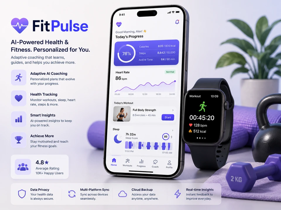 Mobile • Health
Why teams choose us for product design
Designers who work with engineers every day and know what actually gets built.
Learn more about us →Design and engineering side by side
The same team ships the design and the code, so nothing gets lost in translation between Figma and production.
Research grounds the work
We test assumptions with users and analytics before spending sprints on the wrong redesign.
Own the outcome, not just the file
Design work carries through to production, with review cycles and QA on the shipped experience.
Own your design system
Files, tokens, and components live in your Figma and repositories. No dependency on us to keep the system alive.
Questions product teams ask us about design
Practical answers on process, research, and how design engagements actually deliver value.
Can you work with our existing designers?
How do you handle research?
Do you build the design system?
How do you measure success?
What about accessibility?
How do you handle handoff?
Ready to design a product you can actually ship?
Book a working session and we'll shape the design engagement around the metric you need to move.
Book a Discovery Session →